


To provide cursive reading practice in a wide range of handwriting styles, Read Cursive Fast includes several historical documents written in cursive. Most of these are really short (things written by children in their schoolbooks, hundreds of years ago), though one is much longer (the complete Declaration of Independence). In this online supplement to Read Cursive Fast, we will read even more documents from American history.
Important Americans, and their handwritings, come in all shapes, sizes, and types. In our quest for patriotic penmanship, we are always looking for a variety of handwriting samples, so please send us any suggestions for writings that you would like us to consider and include.
Let’s start with a section of a historical document from the twentieth century.
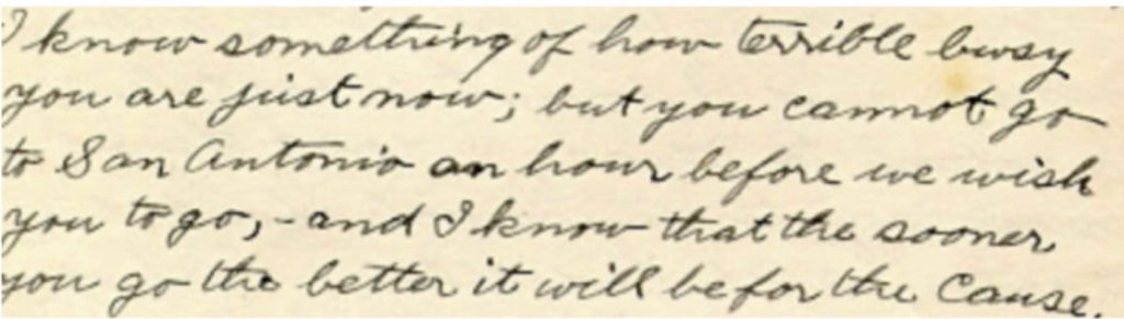
This is a sentence from a four-page letter written in 1912 by a women’s rights worker in Texas, Erminia Thompson Folger. In this letter, she was writing to another Texan women’s rights worker, Annette Finnigan, to plan a campaign to make it legal for women in Texas to vote.
As you read this document, see if you can detect the writer’s occasional small errors in punctuation, grammar, and capitalization. The more easily and accurately you can read a document, the better you will be at detecting even minor mistakes in that document.
Were you able to read what she wrote? To help you check your accuracy, below is an exact transcription of that cursive sentence — errors and all:
I know something of how terrible busy
you are just now; but you cannot go
to San Antonio an hour before we wish
you to go, – and I know that the sooner
you go the better it will be for the Cause.
If you would like to read the entire letter, you can find it on the website of the Texas State Library Documents and Archives Commission, at their permanent “Votes for Women!” online exhibit. Here are links to the individual pages:
At those links, under each page’s photograph, is an exact, typed transcription of that page.
Now, we’ll read some material that’s a little older. Below, you’ll see the signature of James A. Garfield, the 20th President of the United States, on a White House document in 1881, together with the first paragraph of his rough draft for his inauguration speech (also written in 1881).
Before we look at the actual sample, here are a couple of fun facts about President Garfield and his handwriting:
- Garfield had the very unusual ability to write with both hands, even at the same time and in different languages at the same time.
The ability to use both hands equally well to do complicated tasks, such as writing, is called ambidexterity. A person who has that ability is said to be ambidextrous. However, most ambidextrous people cannot write two different things at once, as Garfield could.) During his teaching years, when Garfield’s students got bored or restless, he often regained their attention by writing on the blackboard with both hands at once: writing lines in Greek with his left hand, while using his right hand to write lines in Latin. For more interesting facts about Garfield generally, click this sentence.
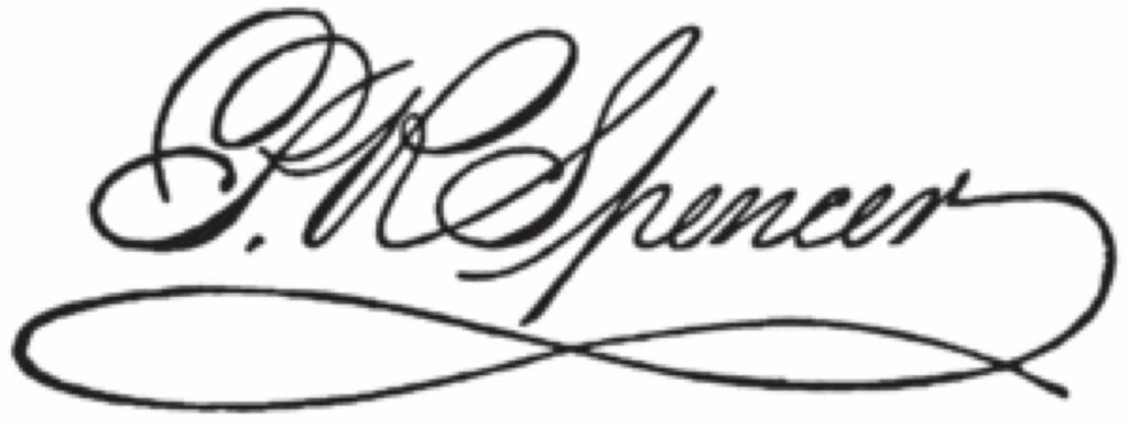
- One of Garfield’s earlier jobs, before he became President, had been as a teacher. The subjects that he taught sometimes included handwriting, which Garfield had actually studied (as an adult) with one of the most famous handwriting teachers of the day, Platt Rogers Spencer. Here is an example of Spencer’s highly flourished signature :
Spencer’s method (called “Spencerian script”) was the most popular of its time. Here, you can see several pages of handwriting from the textbooks written by Spencer (and by Spencer’s sons, who continued their father’s teaching and publishing business for many years).
As you will see at the above link, the Spencerian textbooks included instructions for several styles. The style that Spencer most recommended for everyday handwriting is the style shown in the textbook photo at the bottom of the page at that link.
Although Garfield had done well in Spencer’s classes, his handwriting significantly changed and deteriorated over the years after Spencer’s death in 1864. This can be seen in collections of Garfield’s papers, such as the Library of Congress Garfield collection.
Here, you can see and enlarge a sample of Garfield’s handwriting and signature in 1864.
You can also see and enlarge a sample of Garfield’s handwriting and signature just five years later, in 1869. Notice the differences, as well as the similarities.
However, some writing by Garfield is in a very different style from either of those two samples — a vertical or nearly vertical style that resisted deterioration, and that was much simpler and more legible (except for the signature).
Interestingly, his writings in this style do not deteriorate over the years as his usual handwriting style did. Here, you can see and enlarge one example of Garfield’s second style.
When this style of writing appears in a Garfield document, it may mean that the ambidextrous Garfield was writing that document with his left hand (then signing it with his right, so that the signature would resemble his signature on other documents). This explanation is plausible because:
• most ambidextrous people do produce a simpler, much less slanted (often vertical) writing when they use the left hand, and
• the left-hand writing of ambidextrous people also usually maintains its quality better over years of use (as compared with their right-hand writing).
It is also possible that Garfield was naturally left-handed but was trained to use his right hand for writing, because most people in Garfield’s time (and earlier) incorrectly believed that left-handedness was a defect or abnormality which needed to be “cured” by training the left-hander to try to become an “imitation right-hander.”
However, when it comes to Garfield’s handwriting, we will probably never know for sure — unless someone can invent a time machine and travel back across the centuries to watch him write. We don’t have a time machine, but we can at least look at Garfield’s handwriting ….
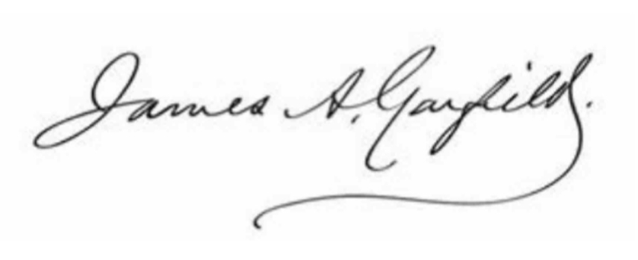
For someone who can read cursive, it is easy to see that his signature reads “James A. Garfield.”
Notes on the signature:
- Garfield’s signature varied a lot during his life, and often looked a little different on personal letters and other informal handwriting, as compared with formal handwriting such as official documents . The above signature, with its print-like uppercase A and fairly simple uppercase G, is typical of official documents that he signed while he was President.
- Putting a period after a signature was a very common handwriting option in the nineteenth century. Other common options then, which are also seen here, were occasionally joining words together (not just letters) and using the last stroke of a signature to underline part or all of the signature.
Let’s look at the opening paragraph of Garfield’s second rough draft for his inaugural address.
First, you need to know that the abbreviation in brackets [“1881 MR. 4”] wasn’t written by Garfield, but is a note made by someone cataloging this document. It is probably a date (with the “MR.” meaning “March”], because Garfield’s inauguration was indeed on March 4, 1881.

Here are some of the things that are a bit hard to decode in Garfield’s handwriting, especially in his rough drafts and other rapid personal writing:
- t-crossbars often floating above the letter t, instead of on it.
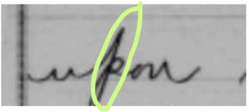
- the top of p becoming an ascender (this was frequent in nineteenth-century handwriting styles and in some early twentieth-century styles
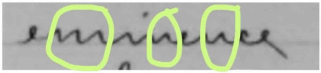
- Garfield sometimes lets convex curves turn into zigzags (with no curve). This sometimes makes letters such as m and n difficult to recognize, as in this word (“eminence”).

- His habit of sometimes joining words together was common in the nineteenth century, but definitely makes the words harder to read.
Here is a transcription of the paragraph that we’ve been looking at:
Fellow Citizens:
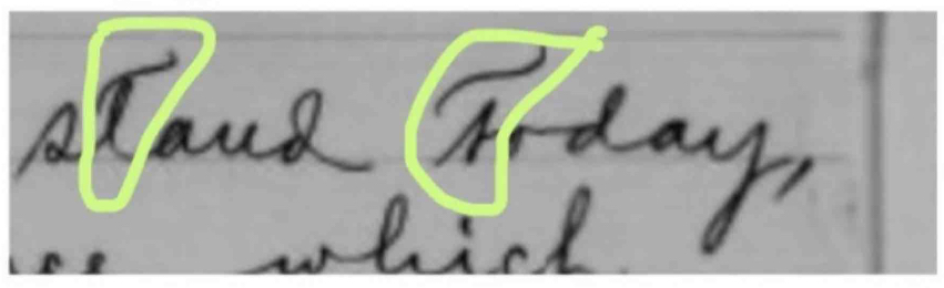
We stand today,
upon an eminence which
overlooks a hundred years
of national life — a century
crowded with perils, but crowned
with the triumphs of liberty
and law. Before continuing
the onward march, let us
pause on this height, for a
moment to strengthen our
faith and renew our hope by
a glance at the pathway
along which our people have
traveled.
This is only the first page, of course. His entire handwritten draft — eleven pages — can be seen online in the Garfield archives at the Library of Congress website. There, you can click on any page to open it clearly at full size, and enlarge the page even further (by clicking on the “+” icon) to zoom in for extreme close-ups on every detail. (If you are using an iPhone or iPad, you can also enlarge the page by using the two-finger “enlarge” gestures.)
For more fun facts about President Garfield and his writing, visit this site about “The Twin Pens of President Garfield.”
It would be interesting to know if Garfield ever discussed ambidexterity or left-handedness with his teacher Spencer. However, we will probably never find out.
Now it’s time for something a little older than Garfield’s letter. In the next photo, you’ll see the title and first paragraph of a very famous American document: the Gettysburg Address, written (and spoken) by President Abraham Lincoln in the year 1863. Here, we will be looking at the title and the first paragraph of one of five surviving copies that are in Lincoln’s own handwriting. You can see and read this copy in full at Google’s permanent online exhibit about the Gettysburg Address.
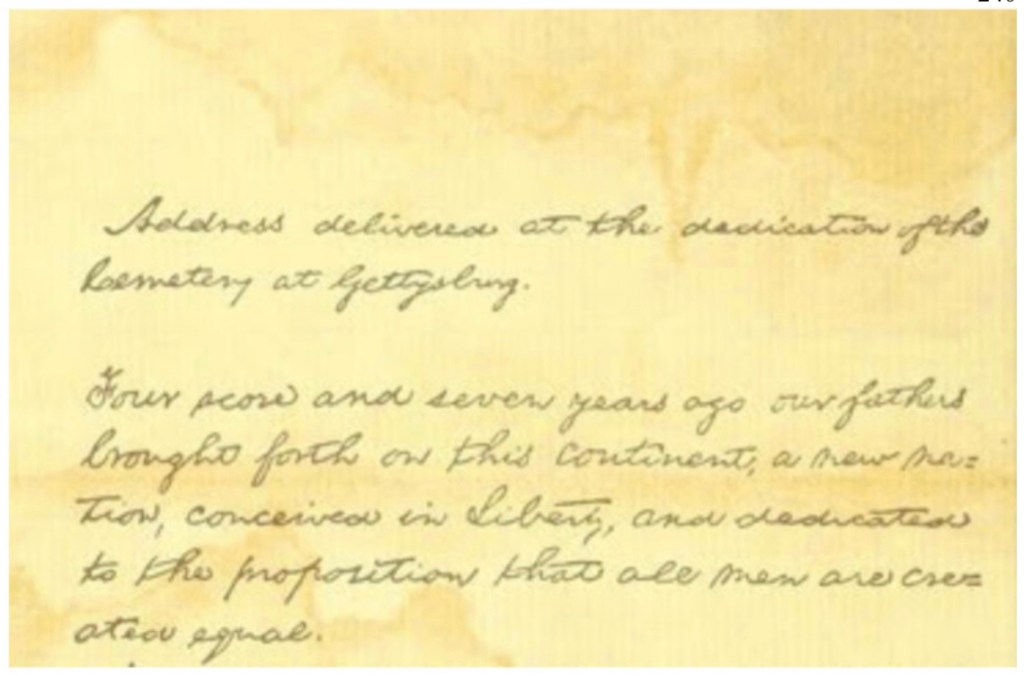
Were you able to read it? Here’s a transcription to help you check your accuracy. Note that this transcription follows Lincoln’s usage of capitals and punctuation, which differs a little from modern usage.
Address delivered at the dedication of the
Cemetery at Gettysburg,
Four score and seven years ago, our fathers
brought forth on this continent, a new na-
tion, conceived in Liberty, and dedicated
to the proposition that all men are cre-
ated equal.
If you would like to see the entire Gettysburg Address in Lincoln’s own handwriting, visit the permanent online Gettysburg Address exhibition, which is part of Google’s permanent “Arts And Culture” online gallery of public domain documents and artwork. The copy that Google shares in its gallery is the same copy that is framed on display in the White House: more details on that copy are below. Each of the Gettysburg Address’s three handwritten pages gets its very own display page in the gallery:
Fun fact about the Gettysburg Address:
The copy in Google’s gallery (which is the one on display in the White House) is one of only five Gettysburg Address copies that are in Lincoln’s actual handwriting. The White House copy is the fifth and last of these copies, and it is called the “Bliss copy” because Lincoln wrote it out for a US Army colonel named Alexander Bliss, who was organizing a fundraiser to raise money to help sick and injured soldiers. Colonel Bliss used his copy of the Gettysburg Address to raise the money, by printing exact copies of this document (making the copies look just like the original handwriting) and selling them at the fund-raiser . To make the copies look just like the original handwriting, he used a printing process called “lithography,” which was the best way to make exact copies of handwriting at the time. (Don’t worry: he let everyone know that these were all just copies and not the original.)
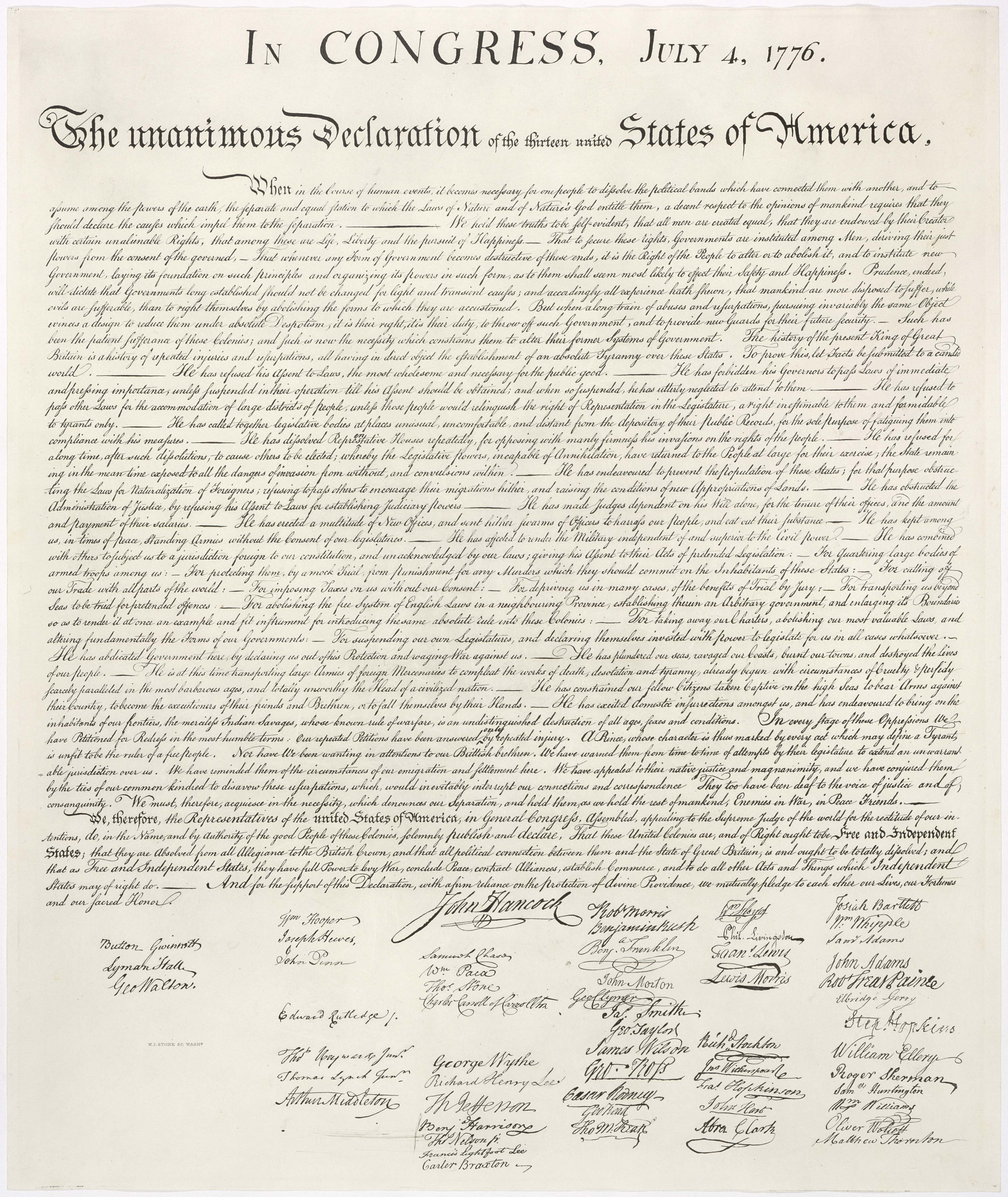
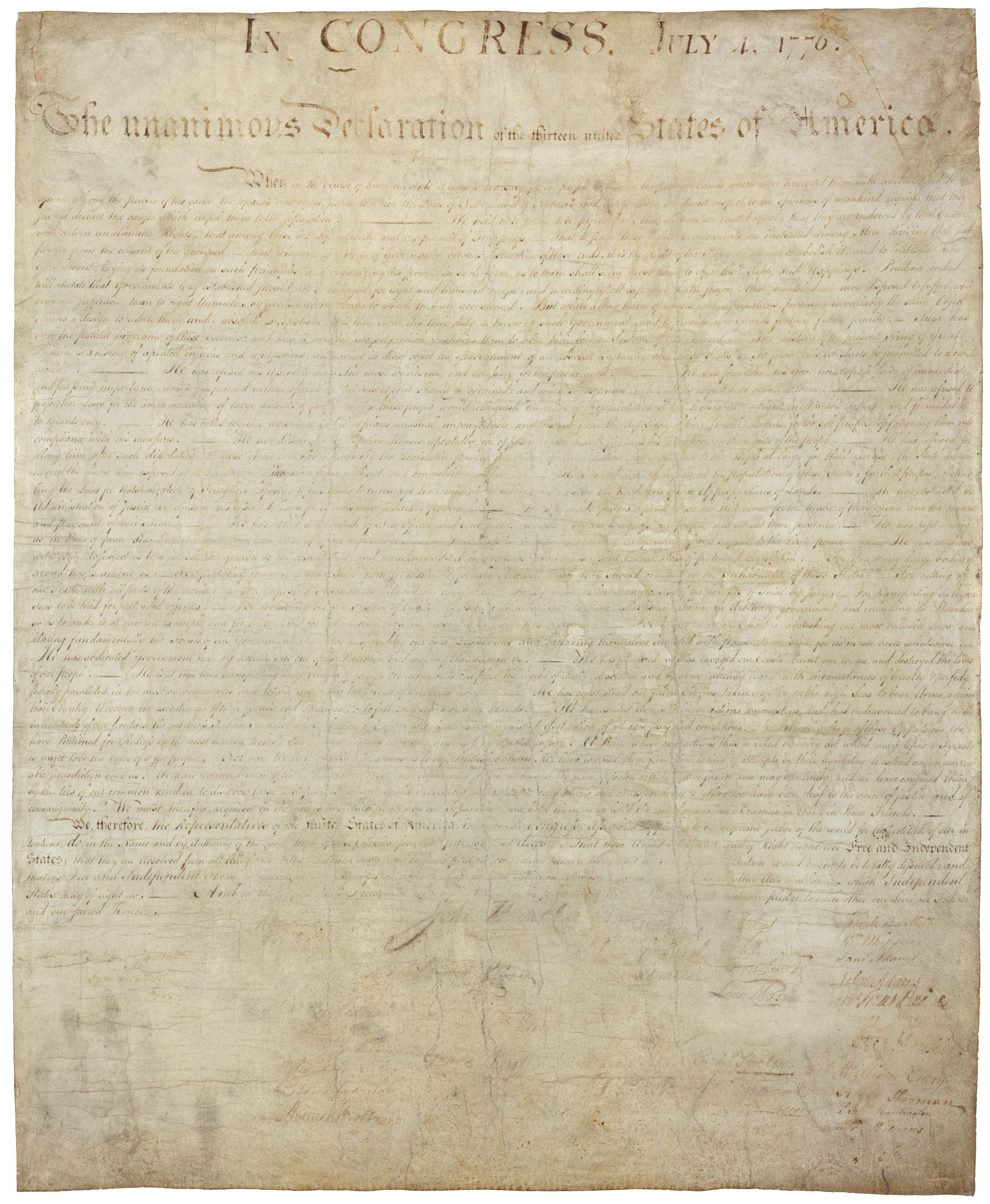
Now, let’s look at some very important writing from the year 1776. You have probably seen the Declaration of Independence in its famous finished form, in Read Cursive Fast and many other places. But have you ever seen any of the rough drafts?
Here are the title and first paragraph of one of Thomas Jefferson’s several rough drafts for of Independence of the United States. You can see the many cross-outs, changes, and corrections that Jefferson made as he worked. Notice that Jefferson often uses a curved ascender on lowercase d, but that sometimes his lowercase d has a straight ascender like ours today.

How well did you read this part of his draft? Check your accuracy by using the transcription below.
Note: the transcription below has been cleaned up — “normalized,” as handwriting detectives say — in order to remove cross-outs and to capitalize one word that Jefferson didn’t capitalize in this document), so that the text will fit the standard rules of correct English today.
If you compare Jefferson’s rough draft with the final copy, you will see that the final copy actually capitalized that particular word that Jefferson left uncapitalized. Exercise your handwriting detective skills by comparing this rough draft passage with the same passage in the famous final copy,
A Declaration by the Representatives of the UNITED STATES OF AMERICA in General Congress assembled
When in the course of human events it becomes necessary for one people to
dissolve the political bonds which have connected them with another and to
assume among the powers of the earth the separate and equal station to
which the laws of nature & of nature’s God entitle them, a decent respect
to the opinions of mankind requires that they should declare the causes
which impel them to the separation.
Question for handwriting detectives: Looking at the original and the transcription, can you find the one word that has a capital in the transcription but that doesn’t have a capital in Jefferson’s rough draft? (Hint: it’s closer to the end of the sentence than to the beginning of the sentence, but it’s ahead of the only comma in the sentence.)
If you would like to read all of this rough draft by Jefferson, you can find it at UShistory.org’s permanent exhibit on the writing of the Declaration of Independence. You can also see this and many other handwritten Jefferson documents by exploring the Library of Congress’s online Jefferson gallery.
Several samples of Jefferson’s handwriting are not only shown, but discussed in detail at “The Good, the Bad, and the Ugly: a Look at Penmanship”: a historical study which examines not only the handwriting of Jefferson, but also the handwriting of several of his family members and a few of the other famous Americans in his life.
Fun facts about the Declaration of Independence:
After Jefferson finished writing the Declaration, the committee sent out a copy of his final version to have a perfect-looking copy made, which would be signed by all members of the Continental Congress. The big job of copying the document by hand, in the flourished cursive of that time, was done by a professional copyist named Timothy Matlack — who was also a well-known brewer and beer bottler! Matlack’s cursive handwriting, not Jefferson’s, is what we see on the famous finished copy.
The final handwritten copy of the document, in Matlack’s near-perfect flourished cursive, wasn’t ready for signatures until August 2, 1776 — a month after independence had actually been declared. (This was not Matlack’s fault. Writing long documents out by hand takes a long time, especially in flourished eighteenth-century cursive, and Matlack probably also had other copying jobs at the time: not to mention his beer business.)
The first copies of the Declaration of Independence that were seen by the American public were printed, not handwritten. This is because all the first 200 copies that were printed by the printer who was chosen for the job (John Dunlap) were ready on July 4, 1776 — the first Independence Day — just two days after Jefferson had finished writing. In other words, the earliest printed copies of the Declaration of Independence are over a month older than the famous handwritten display copy that many people think of as “the original.”
Today the famous display copy of the Declaration of Independence can be closely examined on web-sites which allow zooming in to capture every detail, such as the National Archives online gallery of the USA’s founding documents (Declaration of Independence, Constitution, Bill of Rights, and Amendments).
Here is the National Archives’ gallery link directly to the Declaration — where you can see it yourself and enlarge it to capture every detail.
You can also see it here:
if you would like a full-size paper replica of this famous finished copy, for study or display, an easy and inexpensive place to get one is the Library of Congress — whose gift shop will sell you an exact replica for less than the price of a cup of coffee.
That almost happened to the Declaration, by the way. We are very lucky that this engraving was made, because of one fact that is, well, not so “fun.” Here is what later happened to the actual handwritten display copy over the years.
Effective preservation efforts for the Declaration finally began in 1951 — but not until the document had already been torn, had suffered damage from moisture, and had even picked up a dirty handprint (still visible on the lower left corner).
The moral: always keep a backup — and make sure your hands are clean before reading.
Now that you’ve learned a lot about historical American handwriting by working back from recent times to the Declaration of Independence, let’s look at four pieces of historical American handwriting that are even older. They are very short pieces from the seventeenth century: the signatures of four members of the Plymouth colony.
We’ll start with the one that is easiest to decode:
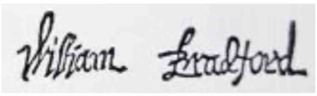
This is the signature of William Bradford, who was the first governor of the Plymouth colony. (Fun fact: Bradford was the first person to call the colony members “Pilgrims.”) Even though we can read his signature, it does have some quirks:
Bradford’s uppercase B was very decorative, but he sometimes failed to close its bottom curve when he was joining B to the next letter.
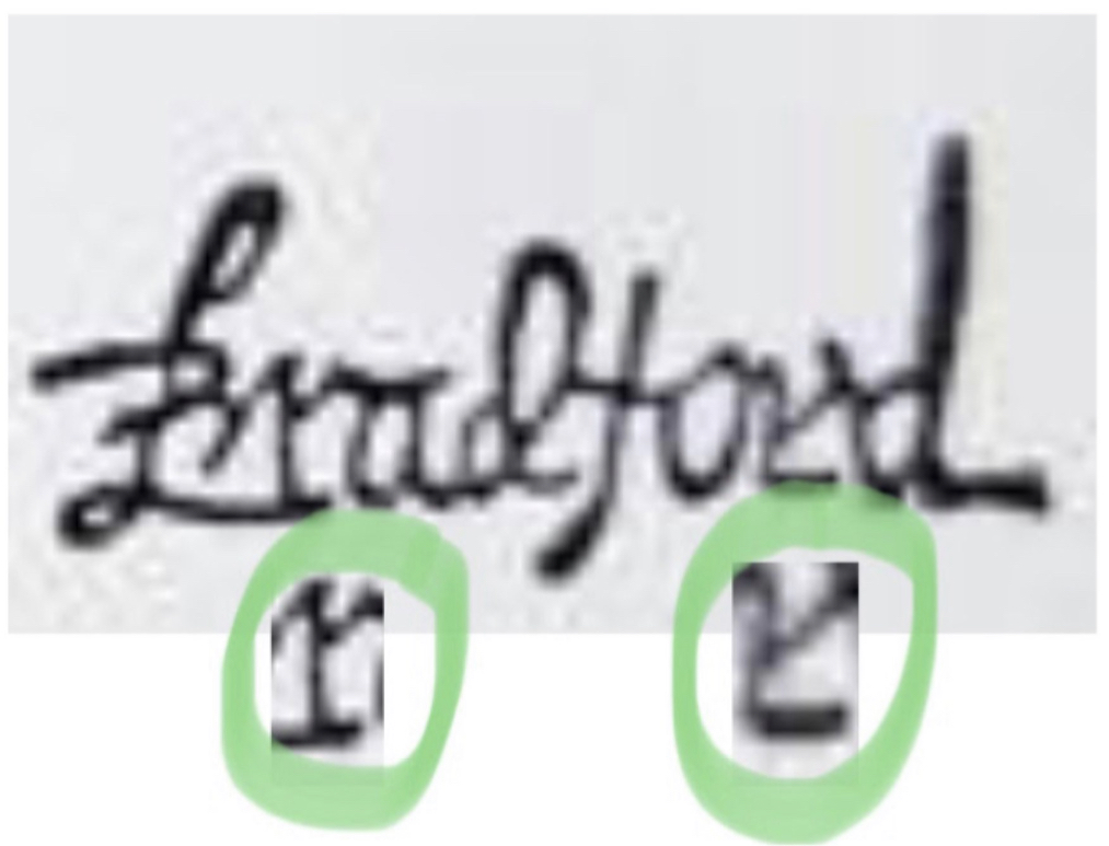
Bradford’s r was not always well formed. In this sample, his first r is very legible, but in the second sample he gave the decorative “foot” of his r more attention than he gave to other parts of the letter.
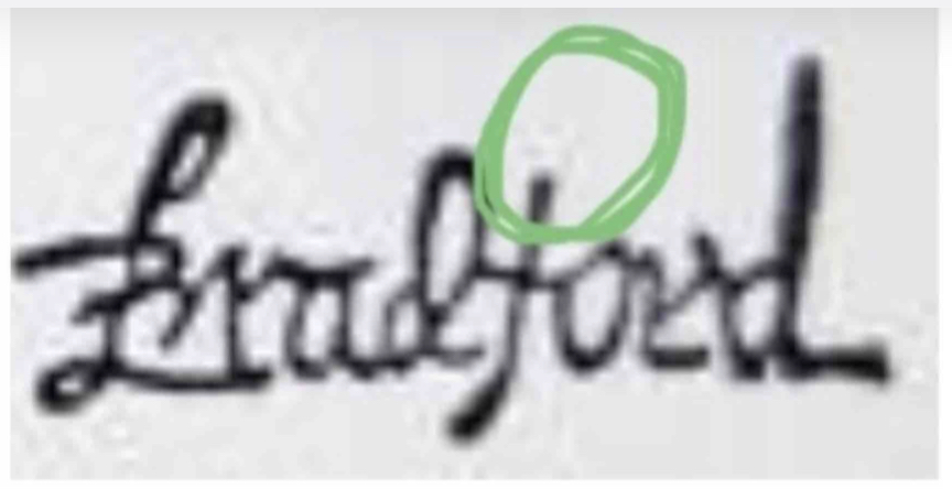
Bradford sometimes neglected the top of his f.
This next one takes a little more detective work.
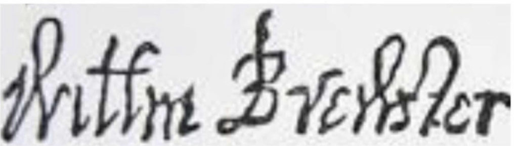
This is the signature of another man named William: William Brewster, who was the senior elder and religious leader of the Plymouth colony.
Loops inside uppercase and lowercase w were a common handwriting option in the sixteenth and seventeenth century.
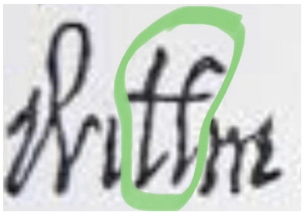
but a handwriting detective can learn to figure it out, even with the missing i-dot.
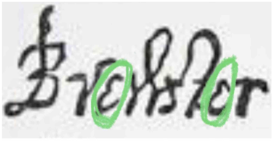
One seventeenth-century option for lowercase e was to write it as a smaller version of cursive uppercase E.
Most of this next signature is also easy to read:
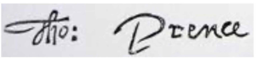
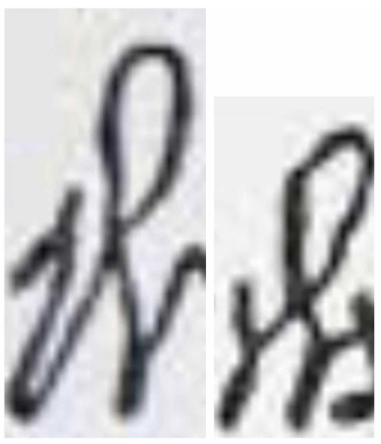
It is the signature of Thomas Prence, who arrived in the colony in 1621 on the ship Fortune (the next ship after the Mayflower). Thomas Prence eventually became the colony’s governor three times, and served for a total of twenty years.
In his signature, his first name is not as easy to read as his last name.
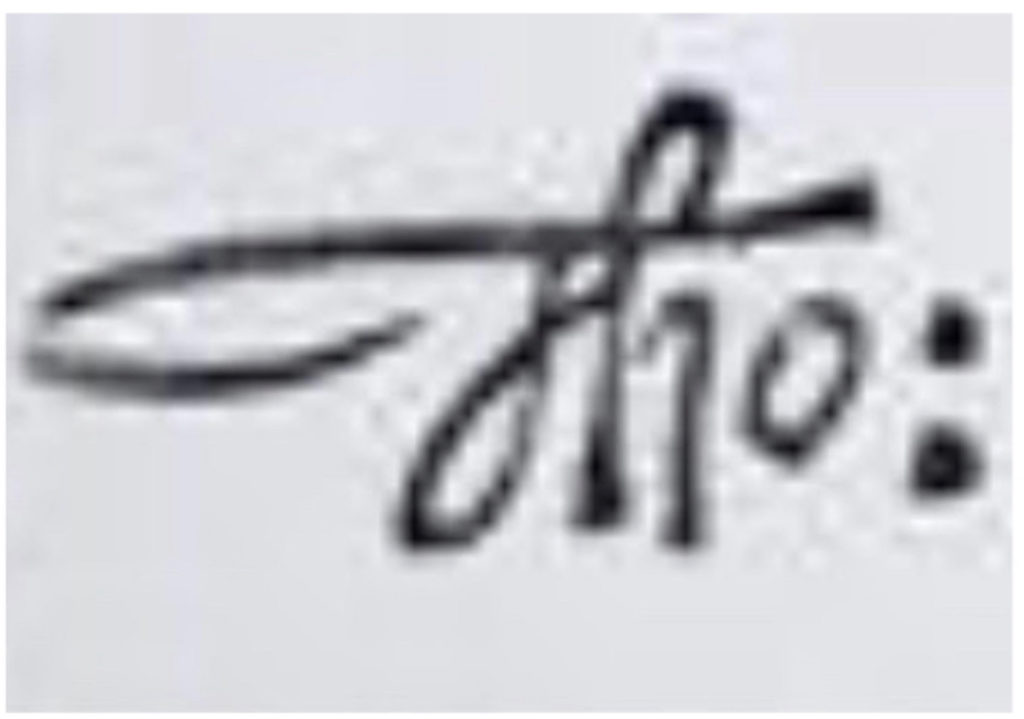
His habit of joining uppercase T to the next letter makes it look more like uppercase F. A bigger problem, for modern readers, is his use of a colon as an abbreviation mark. Today, we use periods for abbreviations, and we don’t abbreviate first names in writing unless we are abbreviating them all the way down to just the first letter.
Here is the last 17th-century signature that we will be reading today:
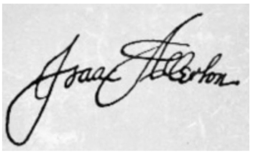
This is the signature of Isaac Allerton, a trader and businessman in the Plymouth colony. Although he was expelled from the colony for suspicious dealings, he began a new and apparently more honest business career among settlers outside the colony, and eventually founded the town of Marblehead, Massachusetts.
To modern readers, the uppercase I in Allerton’s signature looks more like an uppercase J. At this time in history, people were only beginning to decide if I/i and J/j needed to be thought of as different letters or not. Often, these two letters were still considered to be only variations of each other, so a lot of early documents use I/i where we would expect J/j, and/or use J/j where we would expect I/i.
The uppercase A in Allerton’s signature is actually an extremely flourished version of a print-like A:
The loop on the top of his t makes it confusingly like an f — but even this can be figured out, with some thought:

Now that you have been reading so much cursive from the past, you may want to know that deciphering very old handwriting from historical documents is actually a paying career, called “paleography” (sometimes spelled “palæography”). Working with handwritten historical documents (like the ones in this chapter) is what paleographers do. Professional paleographers often have to read documents in a wide variety of cursive and other styles, most of which are even harder to figure out than anything in this book. Here, you can get a taste of what it’s like to work on historical documents as a career, by reading one woman’s description of her experiences working with old documents relating to former US President Theodore Roosevelt.
Getting some experience with the historical documents on this site has probably improved your skill at reading any cursive handwriting that you are ever likely to see. To make sure that you can read even really difficult and badly done present-day cursive writing, you may want to visit another page of this website — the page “Can You Read This?” — and spend time with some of the more difficult handwriting samples we have placed there, to get used to some of the ways that cursive handwriting can look when it is not as carefully done as the samples that you have been reading so far.
If old documents interest you, take a look at the British Museum’s National Archives free how-to course for beginning paleographers.
Let’s wrap up this page with a few handwriting history facts that you can use to amaze your friends and family:
Amazing Facts of Handwriting History
Some of the best-known early Americans had interesting connections with the world of handwriting instruction. Here are some fun facts about the connections between some famous Americans and some famous handwriting teachers.
FUN FACT #1: The first handwriting lessons that were published in the American colonies were co-authored by Benjamin Franklin when his print shop re-edited a British book.
Franklin’s print shop sold textbooks and other books, most of which were either imported from England or were American reprints of books from England. One of the most popular of the imports was a self-instruction book called The Instructor, or Young Man’s Companion, (author: George Fisher), which covered a wide range of useful skills and subject areas, including handwriting. (Other areas covered included geography, grammar, math, and even the basics of various useful crafts and trades such as carpentry and bricklaying,)
However, Franklin and his business partner (David Hall) thought that they could sell a lot more copies if The Instructor didn’t focus so much on British culture. The geography lessons were all about places in England, for instance. (Franklin also saw problems that had nothing to do with the book’s British origins. For instance, The Instructor’s math lessons had some arithmetic mistakes — and many of the book’s pages were blurry and hard to read, because the metal printing plates for that popular book had been used so often that they had become damaged and worn out over the decades.)
So, Franklin and Hall decided to write and publish an American version of the book, and call it The American Instructor, or Young Man’s Best Companion (sometimes referenced as The American Young Man’s Best Companion) — making the printing more readable, correcting the math errors, removing content that was not very helpful in the colonies, and adding material that they thought would be much more useful to Americans. (For instance, Franklin and Hall replaced the geographical material about places in England with geographical material about the American colonies.)
Franklin and Hall kept the original author’s name on the cover, apparently without informing him (which would be I’ll legal today). However, in the book’s preface they made clear where they had added or subtracted or altered material, and why they had made these changes. The illustrations — including the handwriting examples — were probably engraved by Franklin.
His handwriting instruction pages for The American Instructor closely follow the typical handwriting styles used in the eighteenth century. You can see five of Franklin’s handwriting instruction pages in this article on reading 18-century handwriting styles, which is part of DoHistory.org, a historical documents project jointly created by Harvard University and George Mason University.
Franklin’s personal handwriting was a little different from the carefully model-perfect examples that he provided for learners. A letter written by Franklin in 1755 can be seen (and enlarged) at this link to the Library of Congress online collection of Franklin documents.
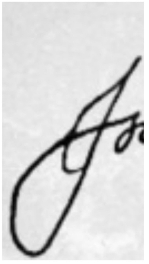
FUN FACT #2: John Hancock had a personal trainer for handwriting.
Most Americans are familiar with John Hancock’s large, decorative signature on the Declaration of Independence, which he was the first person to sign:

Many Americans also know what he said as he put down his quill after signing: “There! I guess King George will be able to read that without his spectacles!”
But not many Americans know that the appearance of Hancock’s handwriting (and the pride he took in it) probably come from the fact that, like many other early Americans, Hancock had regular lessons with a “writing master” — a personal trainer for handwriting. Much like an athletic personal trainer today, a writing master would regularly visit students who were wealthy enough to pay for private lessons and ongoing evaluation.
John Hancock’s writing master was Abiah Holbrook: a fellow Bostonian whose handwriting textbook The Writing Master’s Amusement was an 18th-century American best-seller. Holbrook also owned and operated a handwriting school for children, called the South Writing School, which had over 200 students at one time.
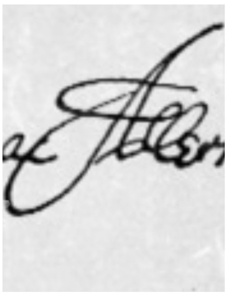
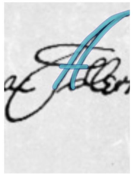
Here is a sample of Holbrook’s handwriting, from his advertising materials:

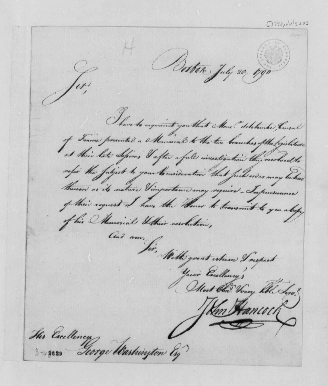
It is interesting to compare Holbrook’s handwriting with Hancock’s. Here is a letter that John Hancock wrote to George Washington on July 20, 1790:
Will future generations be able to read the handwriting of yesterday, or the handwriting of today? Or will it be a closed book to posterity? There are still times and places where keyboard and voice-mail don’t do the job. Paper, pens, pencils, and (nowadays) styluses exist because sometimes we still have to write by hand — or we still want to. Perhaps looking at some of these past handwritings may make us care about writing more legibly ourselves.


